


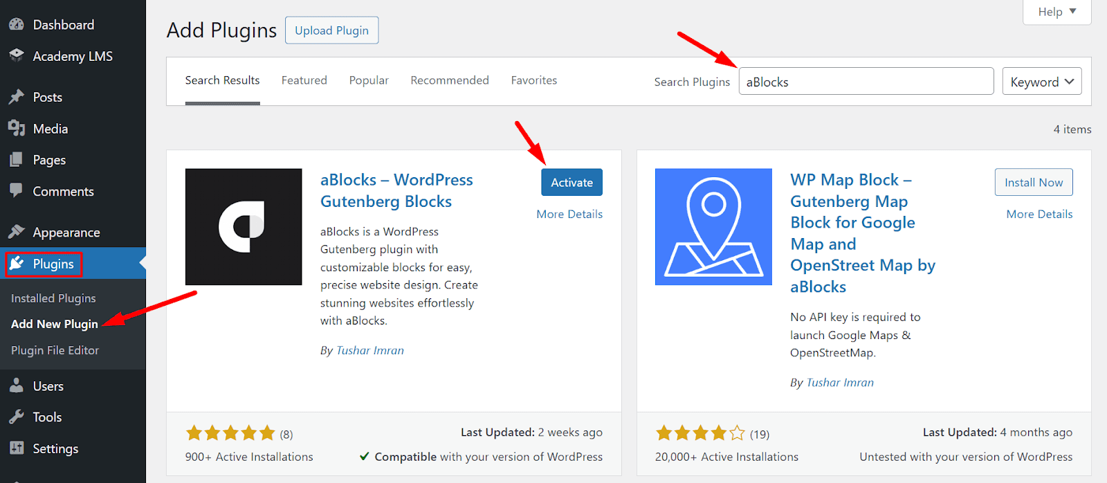
The Academy Password Reset Block is a powerful tool designed to streamline the password recovery process for users of Academy LMS. This block is powered by the aBlocks plugin, which is developed by the same team behind Academy LMS. To utilize this block, ensure that the aBlocks plugin is installed and activated on your WordPress site.
This documentation will guide you through the process of adding and customizing the Academy Password Reset Block on your website.
How to Use the Academy Password Reset Block
Create or Edit a Page
Open the page where you want to add the Academy Password Reset Block. This can be done by navigating to your WordPress dashboard, going to “Pages,” and either creating a new page or editing an existing one.
Click the Plus (+) button in the Gutenberg editor to add a new block. In the search bar, type “Academy Password Reset” and select the aBlocks Academy Password Reset Block from the results. Once inserted, the block will appear on your page, ready for customization.

Customize the Block
After inserting the block, you can tailor its appearance and functionality to match your site’s design and user needs.

Form Options: Content Section Customization
In this section, you can customize the text and labels of the Reset Password form. Below are the available options:
- Form Title: This field allows you to customize the title of the reset password form.
- Username Label: Modify the label for the username or email input field.
- Reset Button Label: Set the text for the reset password button.
- Login Label: Customize the text of the login button, which allows users to return to the login page.
- Show Logged In Message: Enable or disable the display of a message when a logged-in user accesses the form.
Form Options: Style Section Customization
In the Style section, you can customize the appearance of the Reset Password form. Below are the available options:
- Normal & Hover States: You can customize the form’s appearance for both Normal and Hover states.
- Switch between the tabs to set different styles when the form is idle or when users hover over it.
- Background Color: Set the background color of the form.
- Padding: Adjusts the space inside the form between the content and its border. Allows independent control of Top, Right, Bottom, and Left padding.
- Border Style: Choose from different border styles (e.g., Default, Solid, Dashed, Dotted, None). Defines the outline appearance of the form.
- Border Radius: Rounds the form corners. Allows independent control of Top, Right, Bottom, and Left corners.
Form Header and Footer Customize

Typography
- Controls the text style of the form header and footer. For more details on typography settings, check out our aBlocks Typography SettingsDocumentation!
Color:
- Defines the text color of the form header and footer.
Customizing Input Field Style

- Typography: Customize the font style, size, weight, spacing, and line height for input field text.
- Color: Set the input field text color.
- Padding: Adjust inner spacing.
- Border Style: Choose from Default, Solid, Dashed, Dotted, or None.
- Border Radius: Define corner roundness individually.
Button Style Customization

The Button Style settings allow users to customize the appearance of buttons within the form or interface. Below are the available customization options:
Typography
- Set the font style for the button text. By default, it inherits the standard typography settings. For more details on typography settings, check out our aBlocks Typography SettingsDocumentation!
Color Settings
- Normal & Hover States: Customize button appearance in normal and hover modes.
- Color: Define the text color of the button.
- Background Color: Set the button’s background color using a HEX code or color picker.
Padding
Adjust the inner spacing of the button to control its size.
- Available padding options: Top, Right, Bottom, Left (linked or individual values).
Border Settings
- Border Style: Choose a border style such as solid, dashed, or none.
- Border Radius: Define the curvature of the button’s edges for a rounded or square appearance. Configure individual values for Top, Right, Bottom, and Left edges.
You can explore our related documentation for further assistance: