


The Academy Login Form Block is a powerful and user-friendly Gutenberg block designed specifically for Academy LMS users. This block allows you to seamlessly integrate a login form into your WordPress site, enabling users to log in to their Academy LMS accounts directly from any page or post.
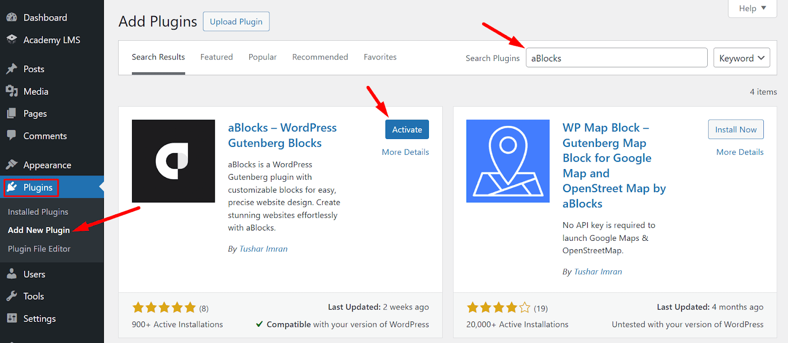
This block is powered by the aBlocks plugin, which is developed by the same team behind Academy LMS. To use this block, ensure that the aBlocks plugin is installed and activated on your WordPress site. Once activated, you can easily add and customize the Academy Login Form Block to enhance the user experience on your site.
How to Use the Academy Login Form Block
Step 1: Create or Edit a Page
- Navigate to your WordPress dashboard.
- Create a new page or edit an existing one where you want to add the Academy Login Form.
Step 2: Insert the Block
While editing the page, click the Plus (+) button to open the Gutenberg block inserter.
In the search bar, type “Academy Login Form”.
Select the aBlocks Academy Login Form Block to insert it into your page.
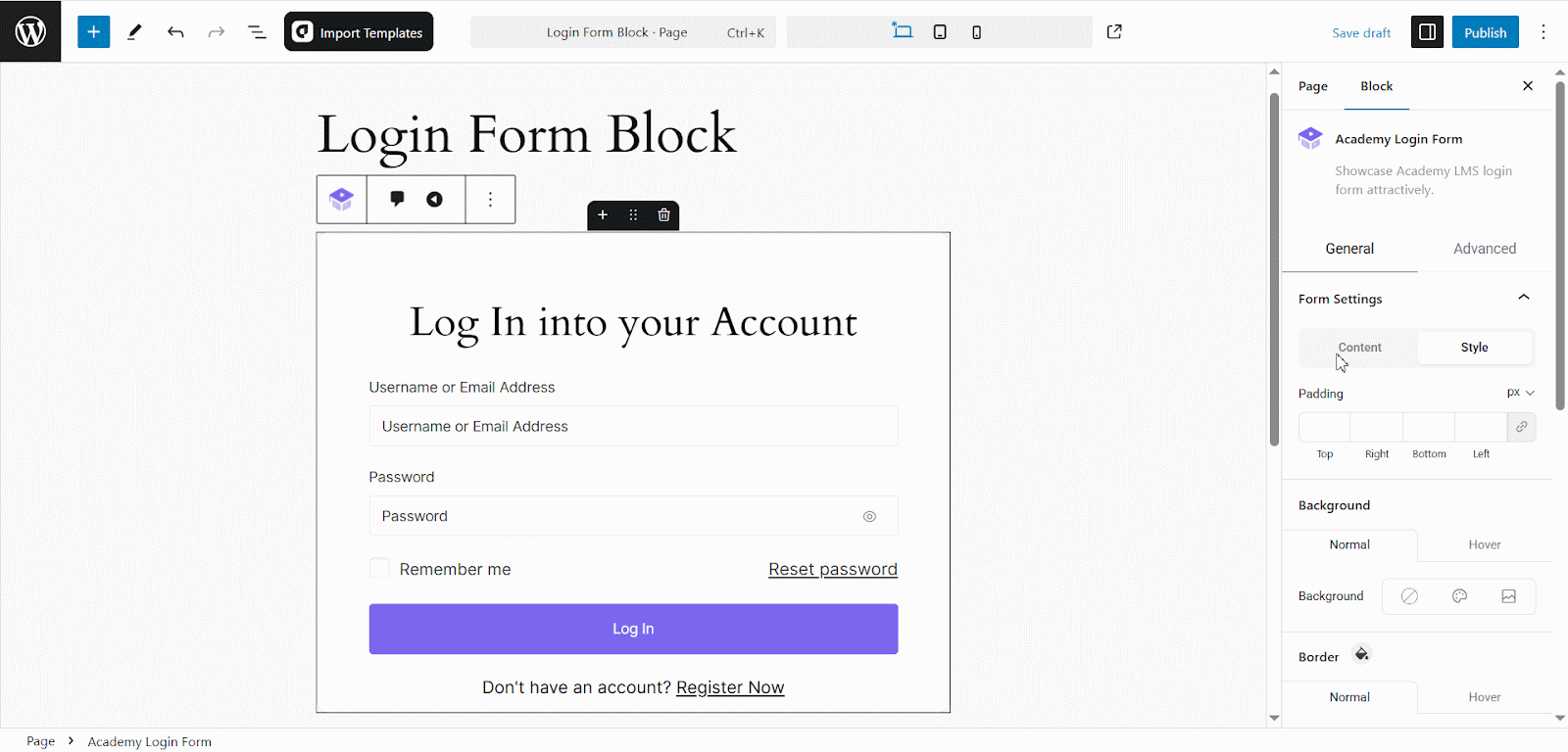
Customizing the Academy Login Form Block
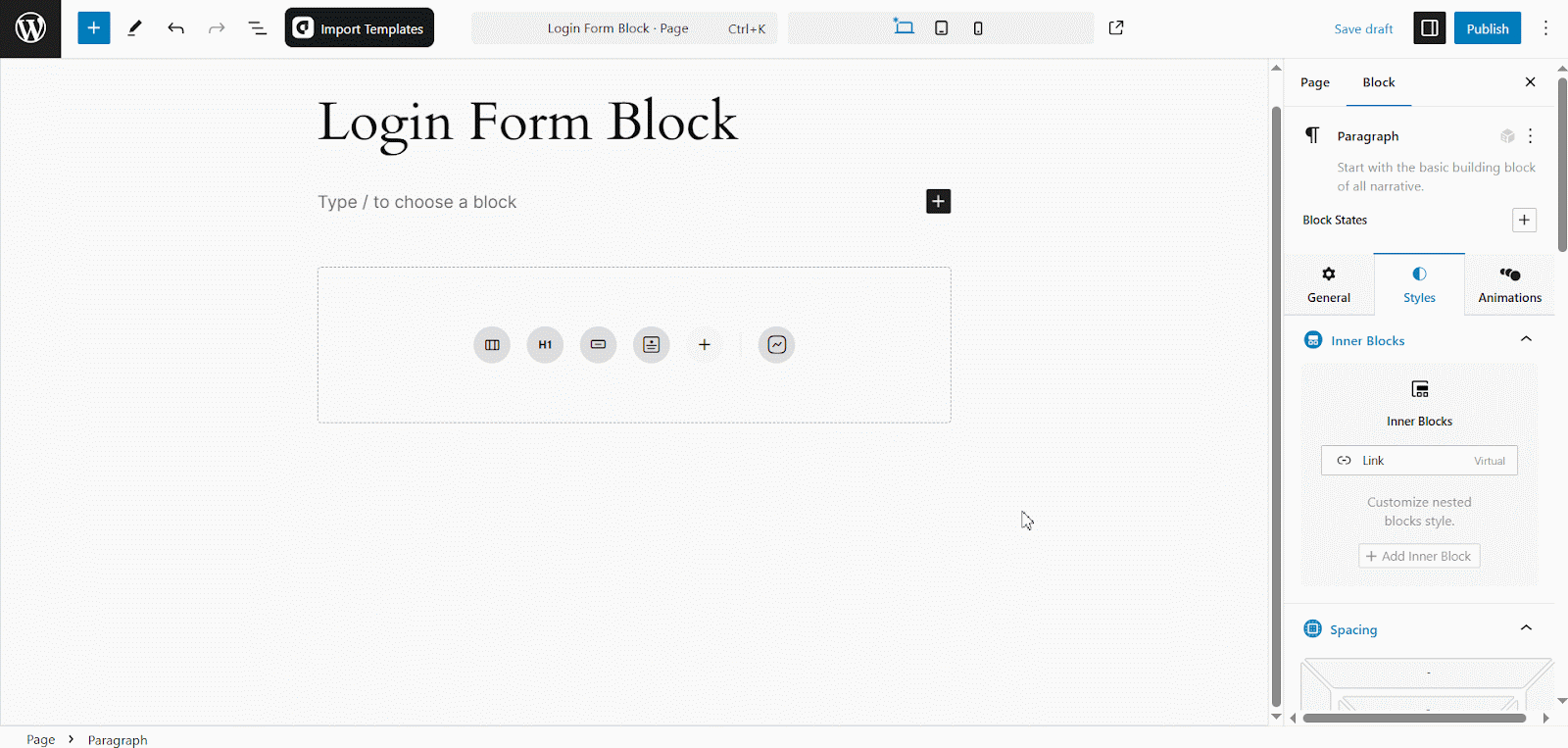
After inserting the block, you can customize it to match your website’s design and functionality.
Form Content Settings

The “Form Settings” panel allows you to modify the login form’s content. Below are the customization options available:
- Form Title: Change the title of the login form (e.g., “Log In to Your Account”).
- Username Label: Customize the label for the username or email input field.
- Username Placeholder: Modify the placeholder text in the username field.
- Password Label: Change the label for the password input field.
- Password Placeholder: Customize the placeholder text in the password field.
- Remember Label: Edit the text for the “Remember me” checkbox.
- Login Button Label: Change the label for the login button (e.g., “Log In”).
- Reset Password Label: Customize the text for the reset password link.
- Student Register URL: Enter a custom URL where users can register as students.
- Login Redirect URL: Define a custom URL to redirect users after a successful login.
- Logout Redirect URL: Set a URL to redirect users after logging out.
- Show Logged-in Message: Toggle this option to display a message for logged-in users instead of the login form.
Form Content Style Settings
The Style section allows users to customize the visual appearance of form elements. Key options include:
1. Padding Settings:
Control the spacing around form elements:
- Set padding (in pixels) for Top, Right, Bottom, and Left individually or uniformly.
2. Background Settings
Customize the background of form elements in two states: Normal and Hover.
- Normal: Set background color, image, or gradient.
- Hover: Define background changes when users hover over the element.
3. Border Settings
- Adjust borders for form elements in two states: Normal and Hover.
- Normal: Choose border style (solid, dashed, etc.), width, color, and corner radius.
- Hover: Modify border style, width, color, and radius on hover.
Form Title Style
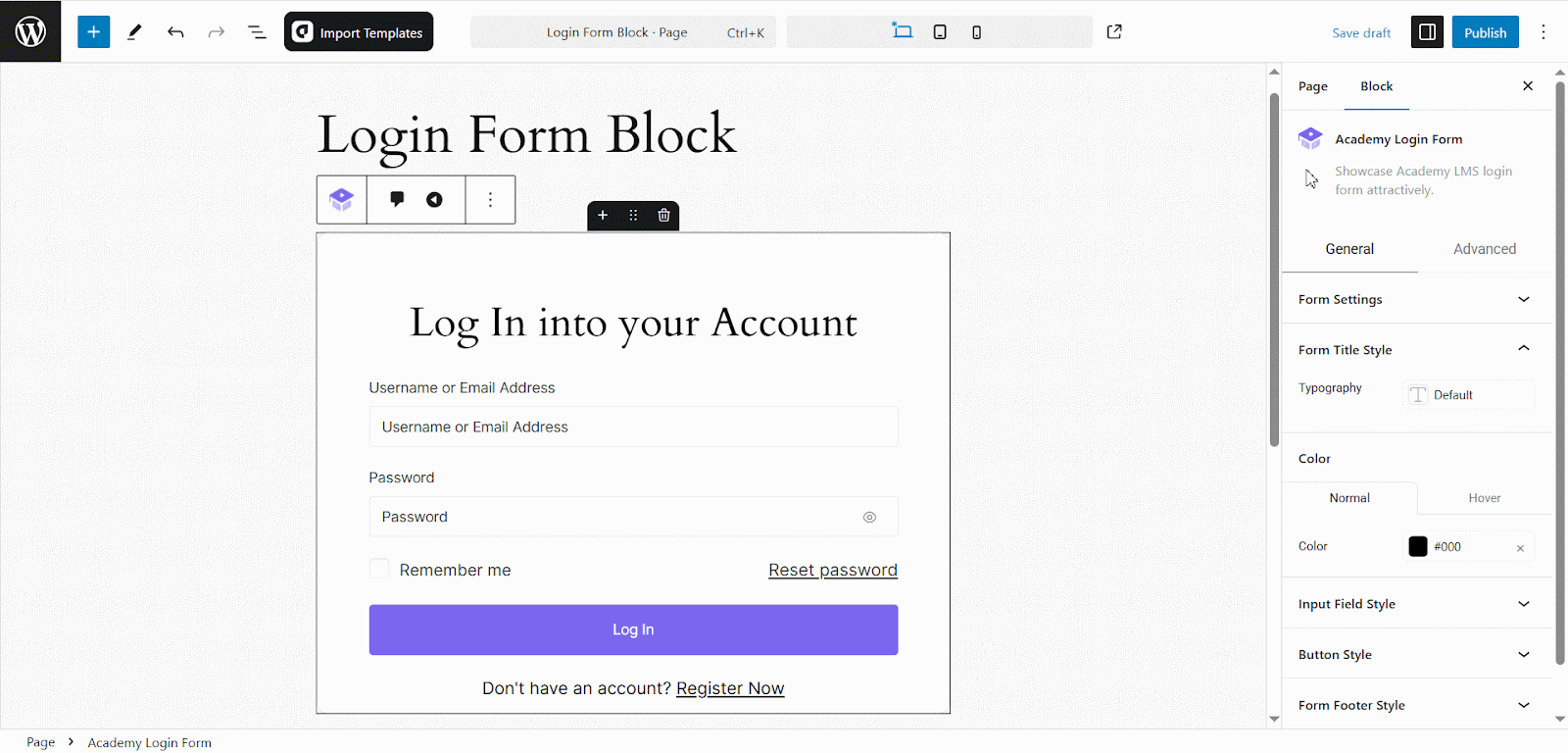
The “Form Title Style” panel allows you to customize the appearance of the form title. Below are the available options:
Typography: Choose a font style for the form title. The default option is provided, but you can select a custom font as needed.
Color Settings:
- Normal: Set the default text color of the form title.
- Hover: Customize the text color when hovered over.
Input Field Style
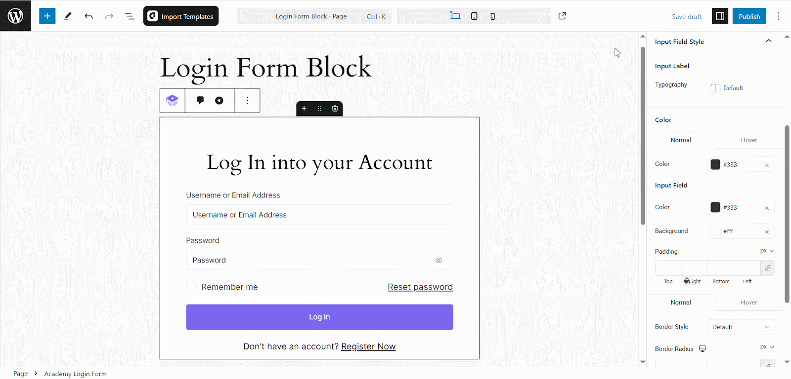
- Input Label Typography: Customize the font style of the input labels.
- Input Label Color: Set the color for input field labels.
- Input Field Color: Choose a color for the text inside input fields.
- Input Field Background: Set the background color for input fields.
- Padding: Adjust the spacing inside the input fields (top, right, bottom, left).
- Border Style: Select a border style (e.g., solid, dashed, none).
- Border Radius: Modify the roundness of input field borders.
Button Style Settings
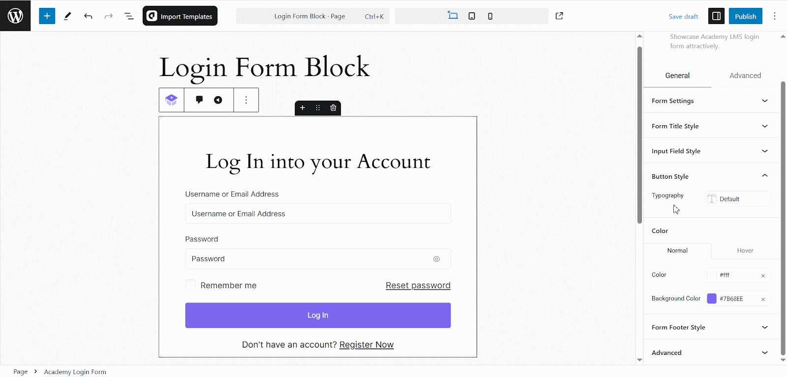
Typography
- Defines the text style of the button.
- By default, it is set to “Default”, inheriting the theme’s typography.
- Users can customize it by selecting a preferred font style.
Color Settings
- Manage the color customization for buttons, including normal and hover states.
Normal State
Color: Defines the button text color. In this case, it is set to #fff (white).
Background Color: Sets the button’s background color.
Hover State: Typically allows users to define a different text and background color when the button is hovered over.
Form Footer Style
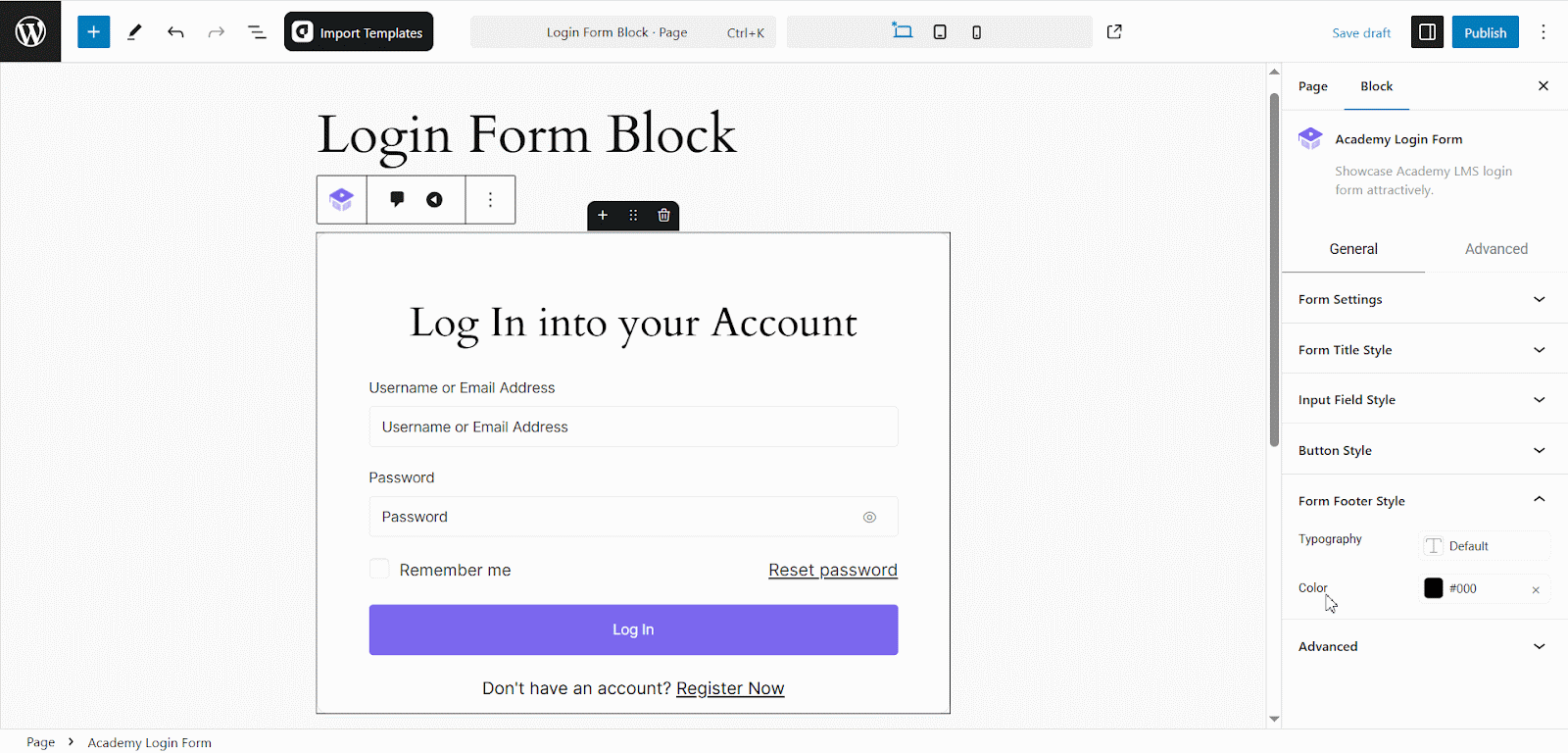
Typography
- Controls the text style of the form footer.
- Currently set to “Default”, inheriting the global typography settings. For more details on typography settings, check out our aBlocks Typography SettingsDocumentation!
Color
- Defines the text color of the form footer.
From the Advanced section, you can modify various design aspects to enhance your form’s appearance and functionality. Customize layout, motion effects, floating effects, tooltips, transforms, backgrounds, borders, shadows, masks, responsiveness, custom CSS, and more to create a visually appealing and stylish form.
Conclusion
The Academy Login Form Block, powered by the aBlocks plugin for Academy LMS, lets you easily add a customizable login form to your WordPress site. By installing aBlocks, inserting the block, and tweaking its content, style, and advanced settings, you can create a secure, branded login experience. For more help, check the Academy LMS documentation or support team.
You can explore our related documentation for further assistance: